In order to understand how well your social strategy is going, Gigg provides two sets of analytics. This article covers the Basic Analytics that come with every Gigg account. To learn more about the Advanced Analytics add-on, please refer to the article linked here.
Navigating to Basic Analytics
-
Verify that your Board User Role is set to either "Member" or "Board Admin".
-
Click on "Analytics" in the left Sidebar Menu.
-
Take a gander at your stats!
Important Note: The dashboard can be filtered by the platform(s) and date that you've selected at the top of your dashboard (For a tutorial on how to filter, click here). So, if you just want to see how you're doing on Instagram for the last 2 months, simply filter to the Instagram platform, only, change your start and end dates, and all of the charts in your dashboard will update accordingly.
Now let's review each of these charts and what they mean.
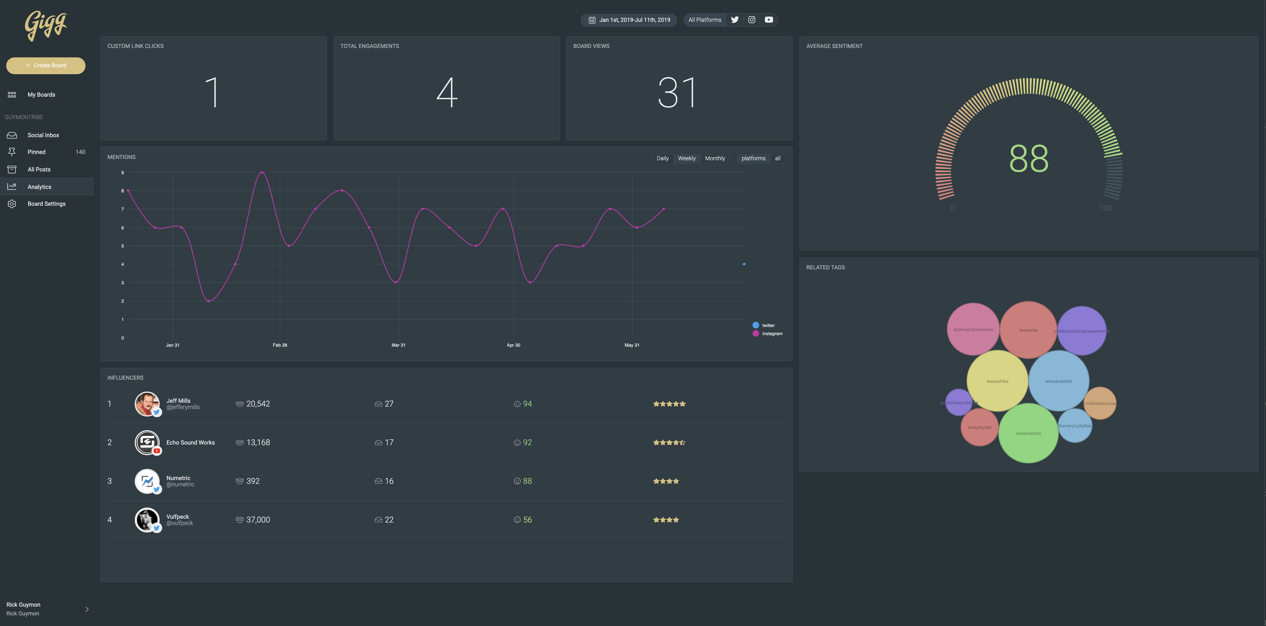
What The Charts Tell Us
Average Sentiment
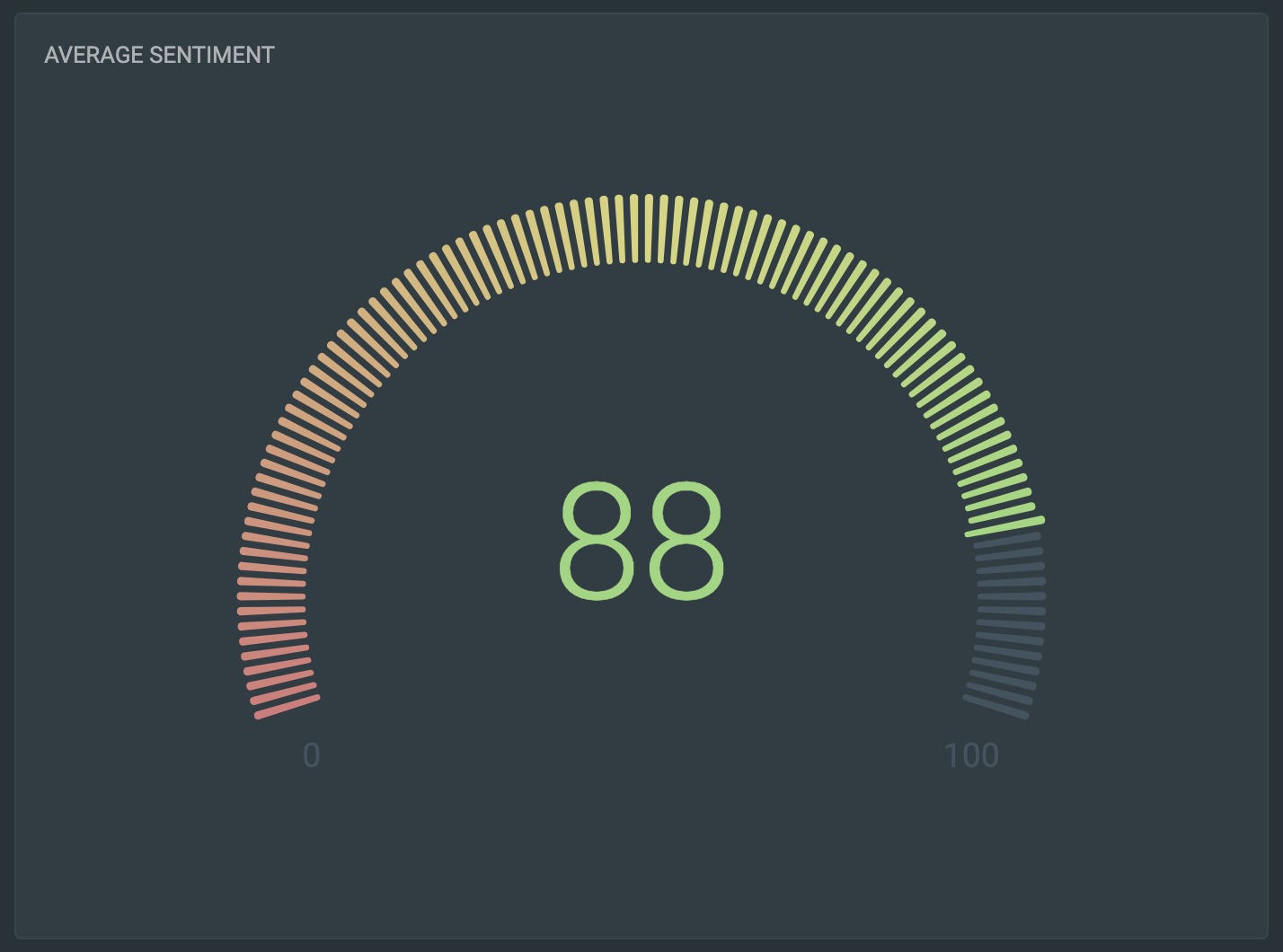
In short, the Average Sentiment chart tells you if the conversation around your brand is positive or negative. When Gigg pulls in social media posts, it runs them through a sentiment analysis before sending them to your inbox. Essentially, algorithms read through the different words and phrases in each post and determine whether the text is positive, negative or neutral. Gigg then assigns a post score between 1 (very negative) and 100 (very positive). In order to get the Average Sentiment, we add each post score together, assign your brand an overall score between 1 and 100 and display that for you in the gauge chart.
Important Note: The Average Sentiment score is derived from an average from every post in your Social Inbox inbox and Pinned views. So, in order for it to be as accurate as possible, you need to block or delete any posts that are not relevant to your brand so they are not included in the score.
Key Performance Indicators (KPIs)
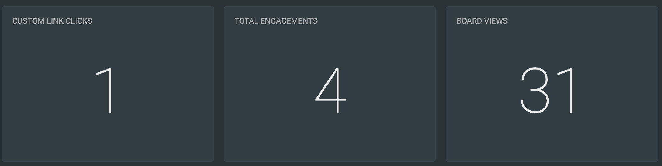
The Key Performance Indicator (KPI) panel is used to provide a quick glance at different aspects of your brand's social performance and Gigg product usage. Let's go through each panel from left to right.
Custom Link Clicks - This number shows how many times the buttons on your web display board have been clicked. Let's say you have a link in one of your posts to an amazon page where followers can buy the product that the post talks about. This number will tell you how many times those buttons have been clicked. In Basic Analytics it shows you the total number from all of the posts. In the Advanced Analytics add-on you can see how many clicks each post brought in, individually, as well as which positions on your web board tend to get the most traffic.
Total Engagements - This KPI adds up the number of likes, comments, shares and retweets your posts have gotten. This allows you to see how people are interacting or engaging with your posts across all platforms in one place.
Board Views - Gigg records and timestamps each time one of your boards is loaded, whether that be from your website or on a monitor in a storefront location. As a result, the boards loaded page tells you how many times people have been to your webpage with the board on it as well as how many of your physical locations have the board up and running. The Basic Analytics keeps them combined while the Advanced Analytics add-on will separate them out by board view type.
Mentions Multi-Line Chart
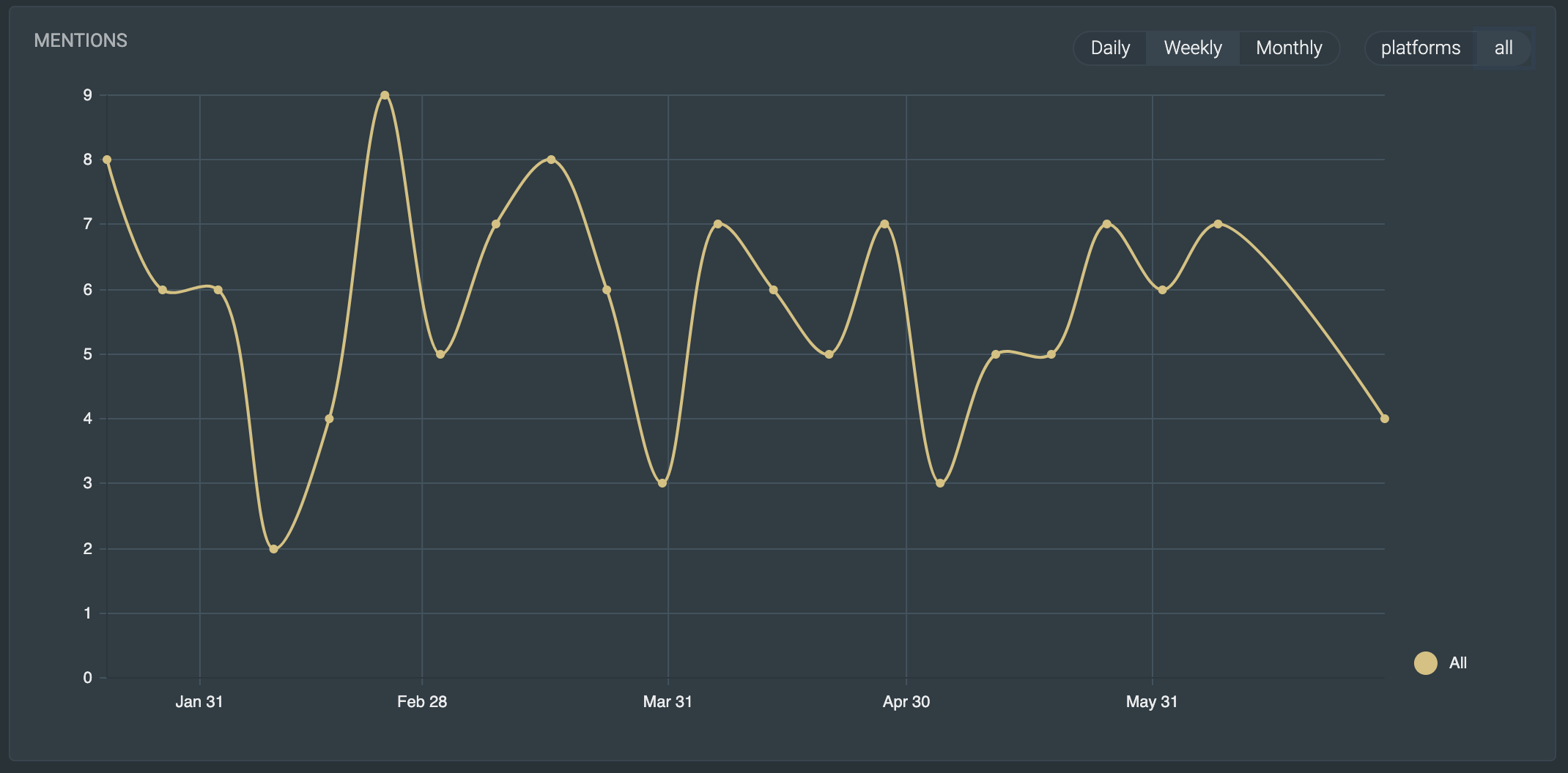
The Mentions chart displays how often your brand is mentioned over time. You can view your Mentions either as a whole (above) or break them out by social platform to see individual platform performance (below). This is the largest chart since, here at Gigg, we think the people talking about you are your greatest marketing team. It's all about helping people become your everyday brand ambassadors and encouraging them to talk about you online. This chart shows how well you're doing.
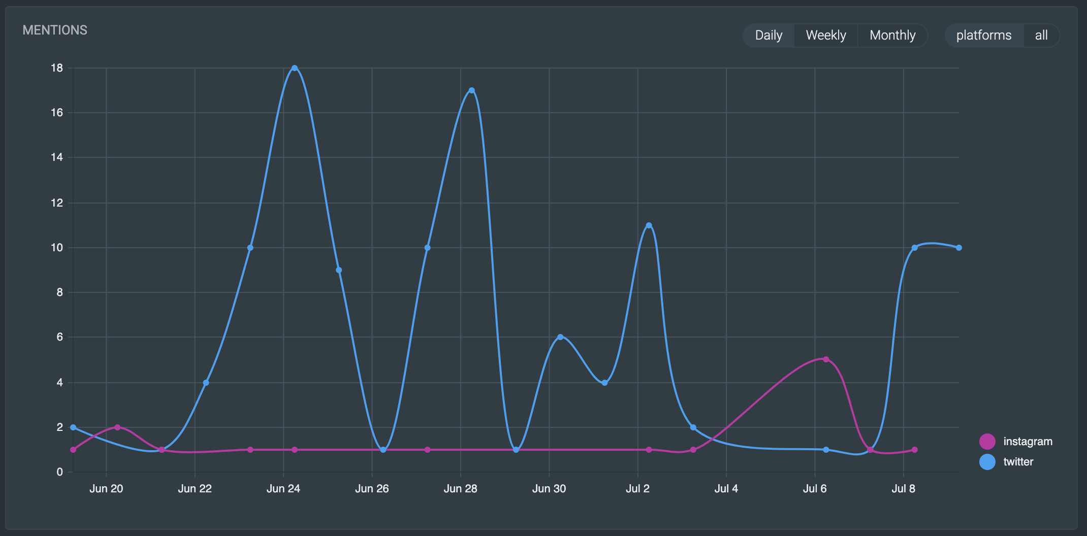
You can also adjust how this chart is displayed by selecting, in the top right corner of the chart, whether you want to see the results by day, week or month.
Influencer Table
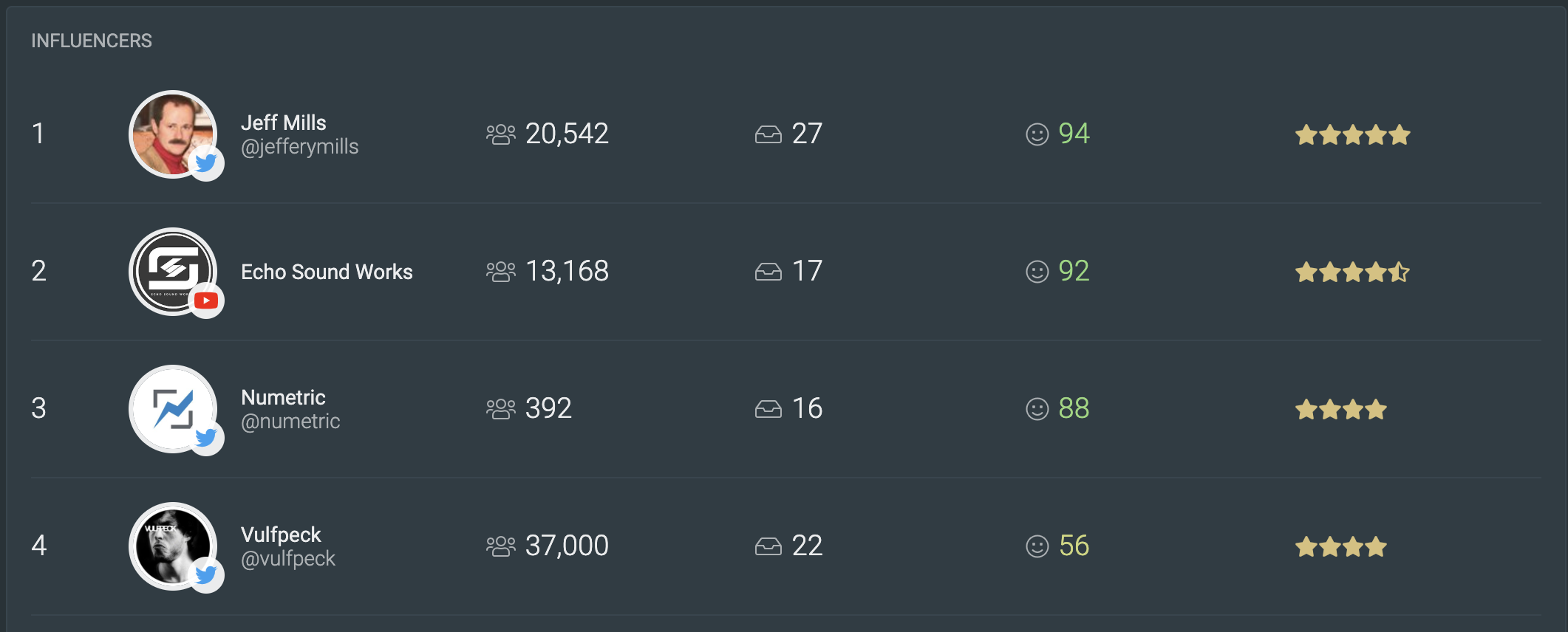
It's no secret that when influencers talk about your brand, it amplifies the value of their social post. The influencer table surfaces those people that are providing the most valuable influence so you can make sure to keep them engaged and incentivized.
The table shows you their username, their following on that platform, how many times they've posted about you, what the average sentiment score is for their posts and gives them a rating of how valuable they are as an influencer to your brand by using a combination of their following, number of posts and sentiment score.
Note: Currently Instagram does not allow anyone to access usernames or follower numbers from people who have mentioned your brand. Thus, this table does not show your influencers from Instagram.
Related Tags Chart
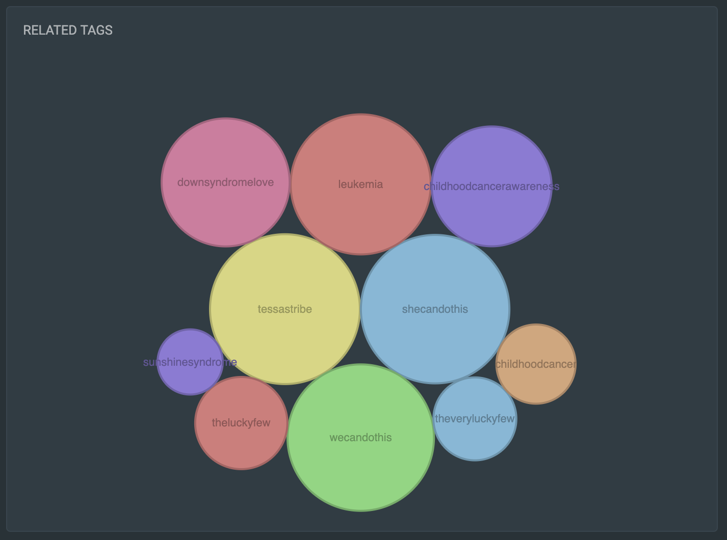
The Related Tags chart is just a quick an easy way to see what other hashtags are being used in posts about your brand. The larger the circle, the more commonly it is mentioned alongside your keywords. When you hover over each circle, a popup will tell you how many times that keyword has been used. This helps you know where to steer the conversation or maybe even where you could find more loyal followers and everyday brand ambassadors.
That's it, for now. We are constantly updating the Basic Analytics page with more useful information, so please make sure that you check back on this article often to get the changes!